menu
CLIENT (AND SITUATION)
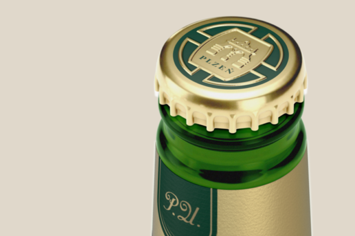
The Pilsner Urquell brand is a source of pride for Czech brewers and beer drinkers and is even considered by many to be the best beer ever. The gold aluminium foil on the top of the bottle was considered a symbol of the Pilsner Urquell bottle, although it only appeared on the bottle 15 years ago. The beer drinkers perceived it as proof of the brand's premiumness, and on top of that, it visibly distinguished Pilsner Urquell from the competition on the shelf. On the other hand, the aluminium foil represented a significant environmental burden, hence the client decided to change the design of the bottle for a significantly more environmentally-friendly one. The key research question was: Can the gold aluminium foil be replaced without losing the perceived premiumness and visibility in stores?


HOW DID WE GO ABOUT IT?
In cooperation with a design agency, the client prepared several variants of the new designs. First, using qualitative interviews and an eye camera, we found out which elements are essential in terms of brand recognition, visibility on the shelf and perceived premiumness. These findings were reflected in the second versions of the designs, where we identified the winning one by using again a combination of in-depth interviews and the eye camera. In the final, third testing phase, we made sure that changing the packaging would not have a negative impact on shopping behaviour.
OUTCOME